Midjourney Review: I Spent 14 Days Testing Its Image And Video Features, And Here’s What I Found
I spent two weeks running Midjourney AI through real-world scenarios — the kind of work designers, marketers, and content creators actually do. I tested image generation across five categories. I tested video generation on three different content types. No cherry-picking. No Photoshop. Just raw outputs and straight talk about what works and what doesn't. Here is what I found.
TL;DR: Is Midjourney AI Worth It?
Yes, if: You need artistic, cinematic, gallery-quality images. You do concept work, social graphics, mood boards, or fantasy art. Speed and aesthetic quality matter more than precision.
No, if: You need photorealistic product shots, readable text in images, precise element placement, or free exploration. You need API access for automated workflows.
Best for: Designers, concept artists, creative directors, marketers, illustrators who value artistic impact over technical accuracy.
Metric | Rating | Notes |
| Image Quality (Artistic) | 10/10 | Best-in-class cinematic and fantasy outputs |
| Image Quality (Realistic) | 6.5/10 | Struggles with products and photorealism |
| Video Generation | 7.5/10 | Great for landscapes, weak on human subjects |
| Text Rendering | 4/10 | Less than 10% success rate |
| Ease of Use | 9/10 | Intuitive Discord-based workflow |
| Speed | 8.5/10 | Fast iteration with Draft Mode |
| Customization & Control | 6/10 | Good prompt understanding, limited precision control |
| Overall Score | 8.5/10 | Gold standard for artistic work, know its limits |
How I Tested Midjourney
I ran structured tests with an AI image generator across five image categories and three dedicated video tests. Each test included multiple prompts ranging from simple to deliberately complex. Every single output was generated fresh with zero post-processing or editing. I evaluated each result on four criteria: prompt adherence, output usability, consistency across regenerations, and real-world applicability.
I did not cherry-pick results. Every image and video you see in this review represents my actual experience — the good outputs and the frustrating ones.
AI Image Generation Testing about Midjourney
Test 1: Cinematic Portrait Photography
Portraits are where image models prove themselves or fail spectacularly. I tested three emotionally specific scenarios requiring technical precision and artistic subtlety. The goal was to see if Midjourney could move beyond generic beauty shots and actually capture mood.
Prompt | Image Output |
| A close-up portrait of a man sitting in a dimly lit jazz bar, looking pensively into the distance. Warm amber light catches his jawline. Film grain, shallow depth of field, Leica aesthetic. | 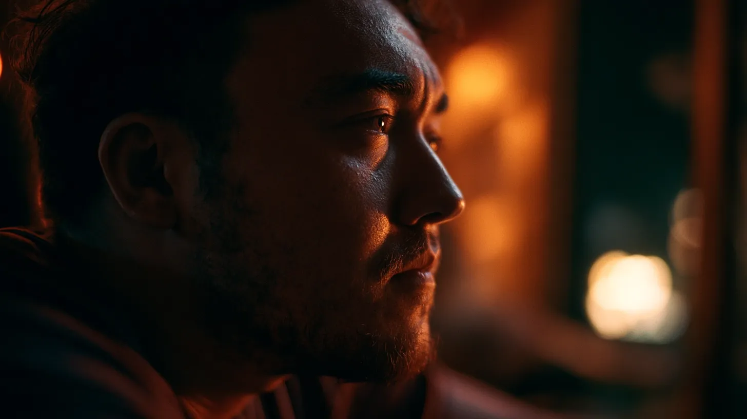 |
The result was stunning. The amber light wrapped around his face exactly like actual cinematography. The film grain texture felt authentic. Skin tone and depth were rendered with subtlety I did not expect from an AI model. The jawline caught light in a way that felt genuinely cinematic.
Prompt | Image Output |
| An elderly fisherman standing on a foggy pier at dawn, weathered face with deep wrinkles, wearing a faded yellow raincoat. Natural light, documentary photography style, Kodak film stock aesthetic. | 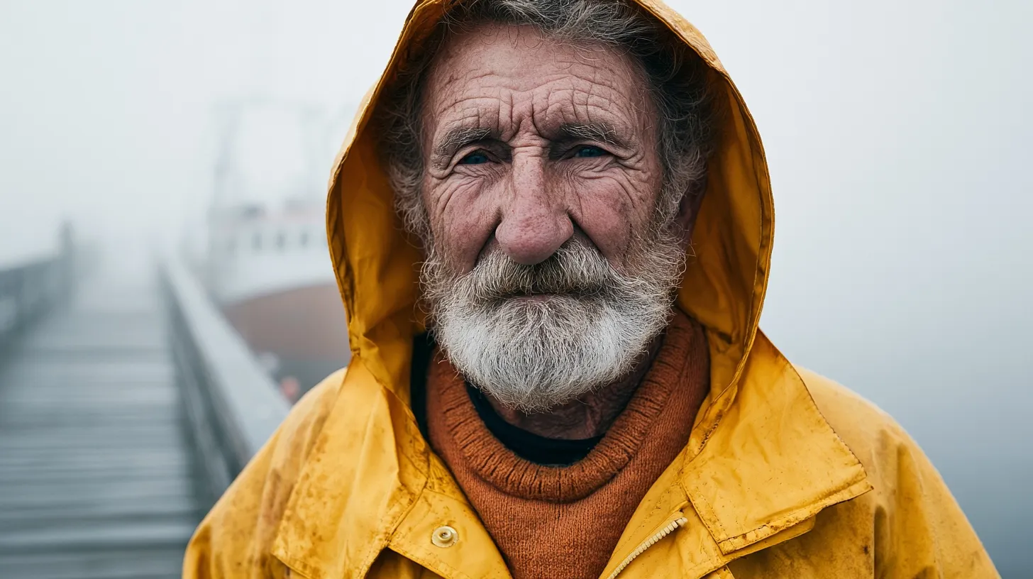 |
This one surprised me even more. The skin texture captured real age — not smoothed over or idealized. Wrinkles looked organic and specific to character. That yellow raincoat had weight and fabric detail. The fog density created depth without overwhelming the subject. It genuinely looked like a National Geographic photograph.
Prompt | Image Output |
| A young woman laughing candidly in a busy Tokyo street market, motion blur in background, golden hour light. Street photography, 35mm film look, candid moment, shallow depth of field. | 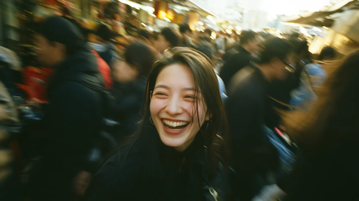 |
Motion blur was handled correctly without looking artificial. The golden hour light felt warm and authentic. The background had appropriate blur without losing context entirely.
The caveat: At full resolution, there is still that dreaminess that gives away the AI origin. Skin has a slightly plastic quality upon extreme zoom. Not a dealbreaker for web, social, or print under 11×14 inches. But for billboard-size work or extreme close-ups, that softness becomes noticeable. If you need photoreal credentials, this is not it. But for artistic cinematic portraits, this is genuinely excellent.
Score: 8.5/10 — Excellent for artistic work, noticeable dreaminess at maximum detail.
Test 2: Fantasy & Concept Art — Midjourney's Comfort Zone
This is where Midjourney has always dominated. I tested complex scene composition, atmospheric depth, and world-building detail to see if it could handle nuanced instructions without requiring heavy prompt engineering.
Prompt | Image Output |
| A lone knight standing at the edge of a crumbling cliff overlooking a ruined kingdom at twilight. Dragons circle the distant horizon. Epic fantasy, oil painting style, dramatic volumetric lighting, Artstation aesthetic. | 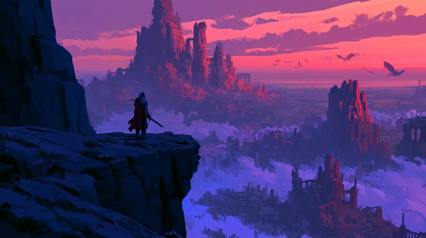 |
Gallery-worthy on the first attempt. The cliff crumbled convincingly with realistic fracture patterns. Dragons in the distance had proper scale and positioning — they looked far enough away to feel epic. Volumetric lighting was actually volumetric — light rays visible through atmosphere creating depth. The oil painting aesthetic felt deliberate, not like a filter applied afterward.
Prompt | Image Output |
| An ancient underwater library, bioluminescent fish weaving between towering shelves of glowing manuscripts, shafts of pale light filtering down from a distant surface. Hyperdetailed, painterly style, otherworldly mood. | 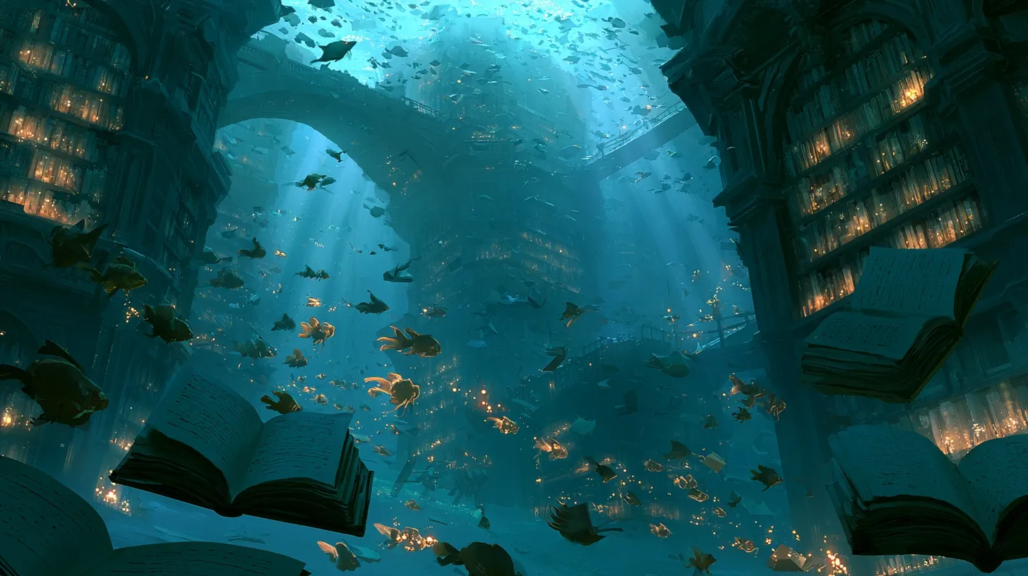 |
This stopped me cold. The bioluminescent light was not just glowing texture — it actually illuminated the manuscripts from within creating realistic light behavior. Fish positioning felt purposeful rather than random. Shelf architecture held together structurally. The pale light shafts from above created real depth perspective and atmospheric scattering. I genuinely did not expect an AI model to render "otherworldly" this convincingly.
Prompt | Image Output |
| A cyberpunk street market in a rain-soaked Tokyo alley, neon reflections on wet cobblestones, vendors in holographic stalls, flying drones overhead. Cinematic widescreen, fog layers, Blade Runner aesthetic. | 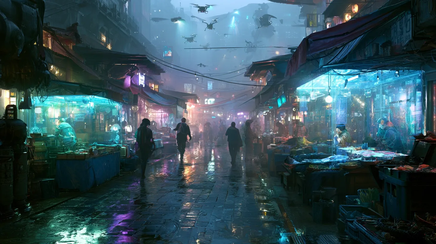 |
The neon-on-wet-pavement reflection was executed perfectly with realistic light bounce. Holographic stalls looked ethereal without being incomprehensible or blurry. Fog layering created visual depth without obscuring the scene. Drones positioned naturally in space rather than awkwardly floating.
Score: 9/10 — Truly exceptional. This is what Midjourney was built for.
Test 3: Architecture & Interior Design
Interior designers rave about Midjourney's spatial logic and lighting accuracy. I tested whether that reputation actually holds up, with specific focus on structural integrity and material authenticity.
Prompt | Image Output |
| A minimalist Japanese tea house interior, tatami floors, shoji screens casting soft afternoon light, a single ikebana arrangement in the corner. Architectural photography, natural textures, clean composition. | 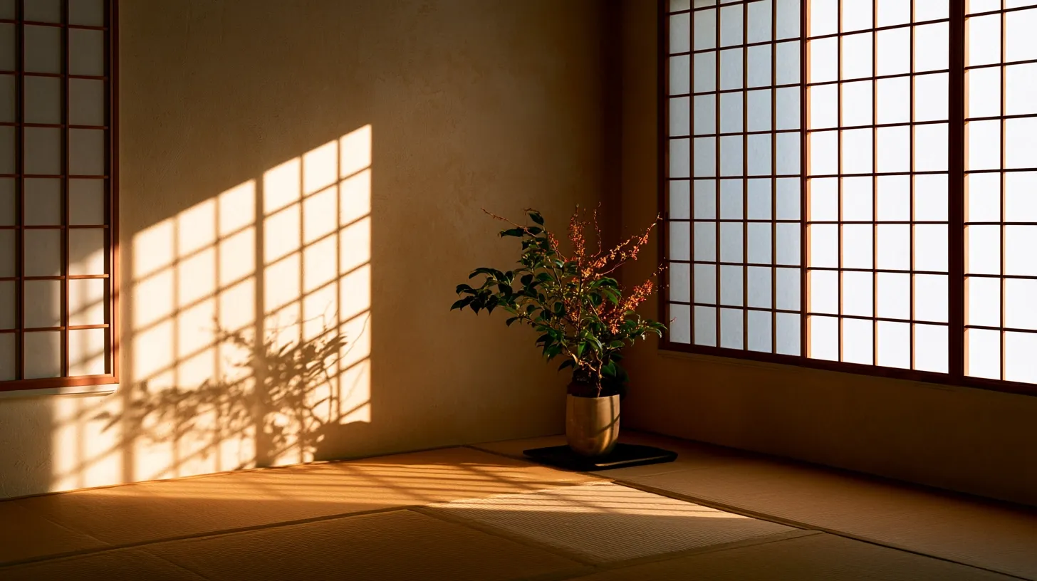 |
Midjourney nailed the spatial logic. Light filtered through shoji screens in realistic patterns that follow actual light behavior. Tatami floor proportions looked accurate — the dimensions felt right. The ikebana arrangement sat naturally in negative space. Material textures — the woven straw of tatami, the translucent paper of shoji — came across as authentic, not generic or flat.
Prompt | Image Output |
| A brutalist concrete apartment lobby, high ceilings, cracked tiles, a single flickering fluorescent light. Melancholic mood, documentary style, analog photography, atmospheric. | 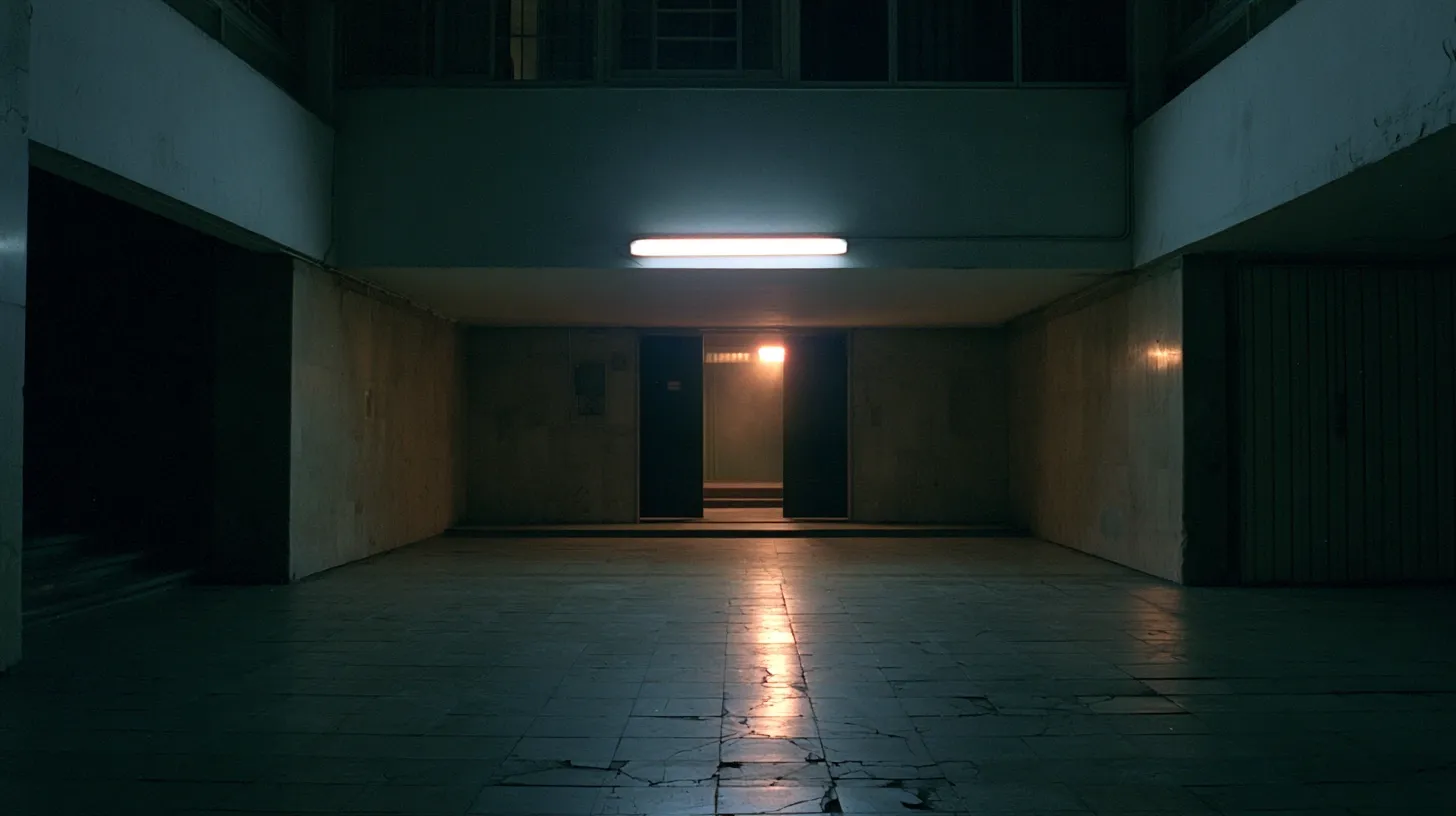 |
Here is where I saw real understanding. Midjourney captured a very specific aesthetic and emotional tone — that melancholic, raw feel that is hard to describe but instantly recognizable. Cracked tiles looked aged naturally with realistic wear patterns. Concrete had that raw, unfinished quality authentic to brutalist architecture. The single fluorescent light cast lonely shadows creating mood. The atmosphere was deliberate and cohesive.
Prompt | Image Output |
| A luxurious Moroccan riad courtyard at night, intricate zellige tilework, a central fountain, string lights overhead, warm golden lantern light. Wide angle, rich detail, inviting atmosphere. | 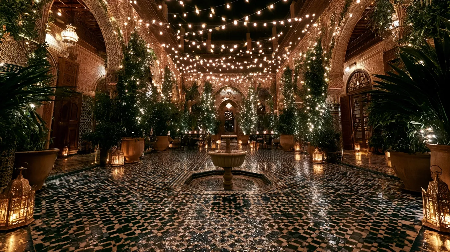 |
The zellige tilework had real geometric accuracy and complexity. That is not trivial — geometric patterns are historically difficult for AI models. The fountain sat naturally as a focal point without looking awkwardly placed. String lights and lantern light created warm layering. The courtyard felt genuinely inviting rather than sterile or synthetic.
The issues: One regeneration had a ceiling beam floating six inches from where it connected to the wall. Small structural error, but noticeable at close inspection. Occasionally, spatial perspective breaks down — doors sometimes too small for the room proportions, or windows in illogical positions. Not frequent, but worth watching for in critical architectural work.
Score: 9/10 — Excellent spatial understanding with occasional structural quirks.
Test 4: Style Transfer — The Nuance Test
Style transfer is harder than it looks. I tested whether Midjourney could apply specific aesthetic references consistently without just copying surface details. This required actual artistic understanding, not just pattern matching.
Prompt | Image Output |
| A busy café, people reading newspapers, espresso cups on marble tables. In the style of Edward Hopper — solitude within crowds, flat light, quiet tension, melancholic emotional tone. | 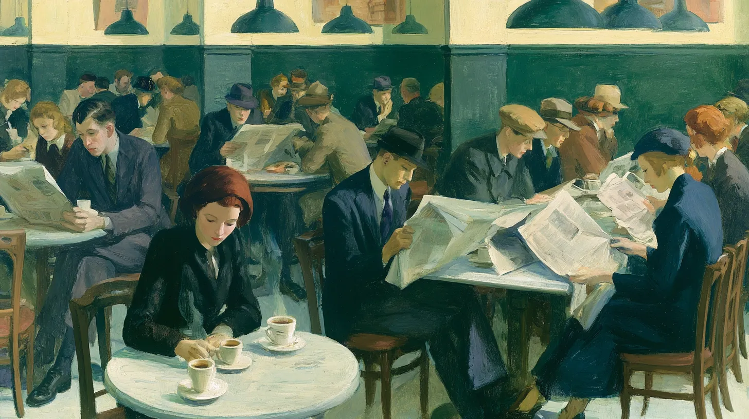 |
This is the one that impressed me most in the entire test. Midjourney did not just apply Hopper's color palette or brushstroke style. It captured something harder — that emotional quietness that defines his work. The sense of isolation within community. The flat, slightly melancholic light. It felt like Hopper, not like a Hopper filter was applied afterward.
Prompt | Image Output |
| A mountain valley in autumn, trees in full color, a dirt path winding toward a farmhouse. In the style of Andrew Wyeth — muted palette, melancholic realism, tempera texture, introspective mood. | 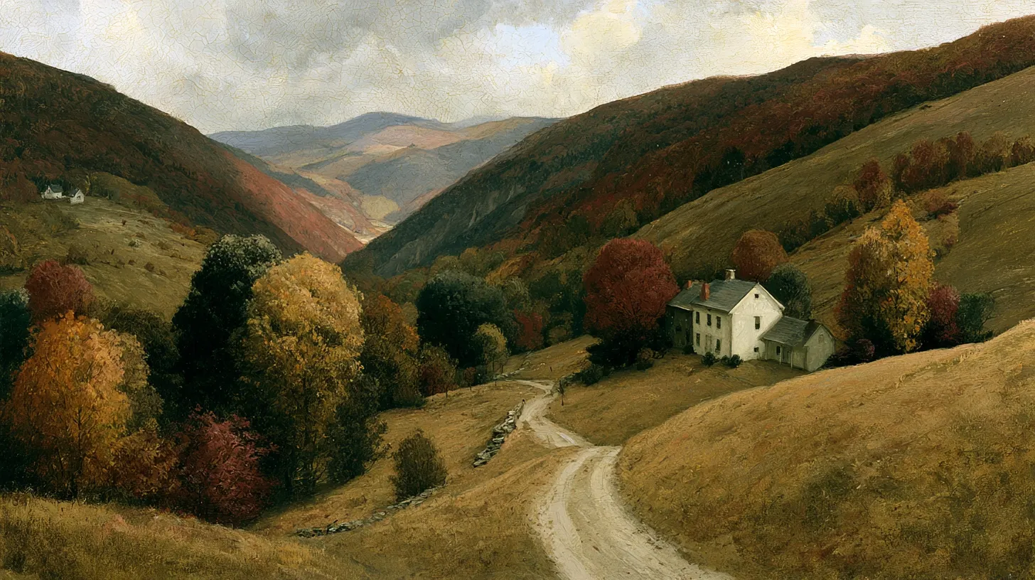 |
The Wyeth interpretation was close but leaned slightly more saturated than his actual palette, which tends toward reserved, dry color choices. The path and farmhouse composition matched Wyeth's preference for intimate, specific locations. Texture came across as painterly without feeling artificial or overdone.
Prompt | Image Output |
| A street scene with rain, vintage cars, a man in a long coat under an awning. In the style of a noir graphic novel — high contrast, ink wash, shadow-heavy, dramatic lighting. | 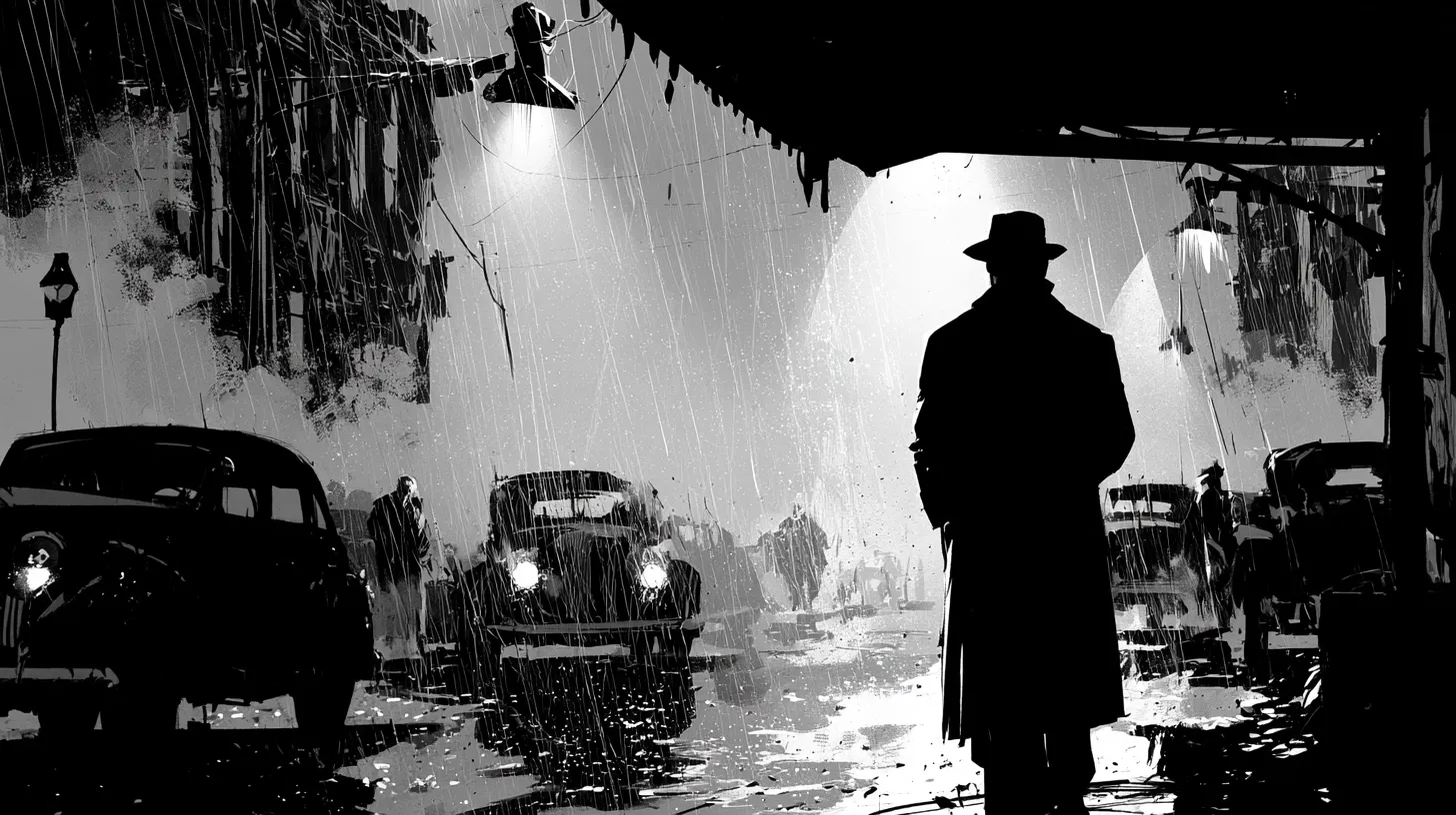 |
Immediately usable as-is. The high contrast worked perfectly. Blacks and shadows were heavy and purposeful creating moodiness. The man's silhouette and posture felt noir-appropriate and cinematic. Vintage cars popped against dark backgrounds correctly without losing the noir aesthetic.
The takeaway: Midjourney handles style transfer better than competitors because it understands mood and intent, not just aesthetic rules. You can tell it "capture the feeling of X artist" and it attempts emotional translation, not just visual imitation.
Score: 9/10 — Emotional style transfer is genuinely impressive.
Test 5: Product & Commercial Photography — Where Midjourney Struggles
This is the reality check. Commercial work demands precision that Midjourney has historically struggled with. I tested three product categories to understand real limitations.
Prompt | Image Output |
| A minimalist product shot of a luxury ceramic coffee mug, white background, soft window light from the left, single handle visible, perfect proportions, commercial photography style, sharp focus. | 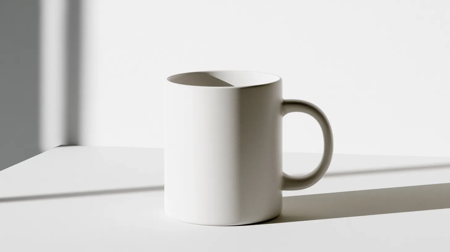 |
Prompt | Image Output |
| A sleek stainless steel water bottle on a wooden surface, lid closed, reflection visible, clean product photography, minimal shadows, professional lighting. | 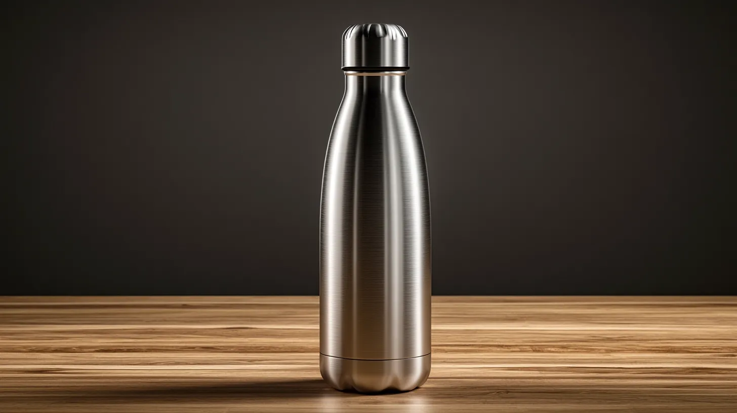 |
Prompt | Image Output |
| A luxury watch displayed on a marble pedestal, gold case, leather strap, three-quarter angle, professional product lighting, shadows properly rendered, commercial photography. | 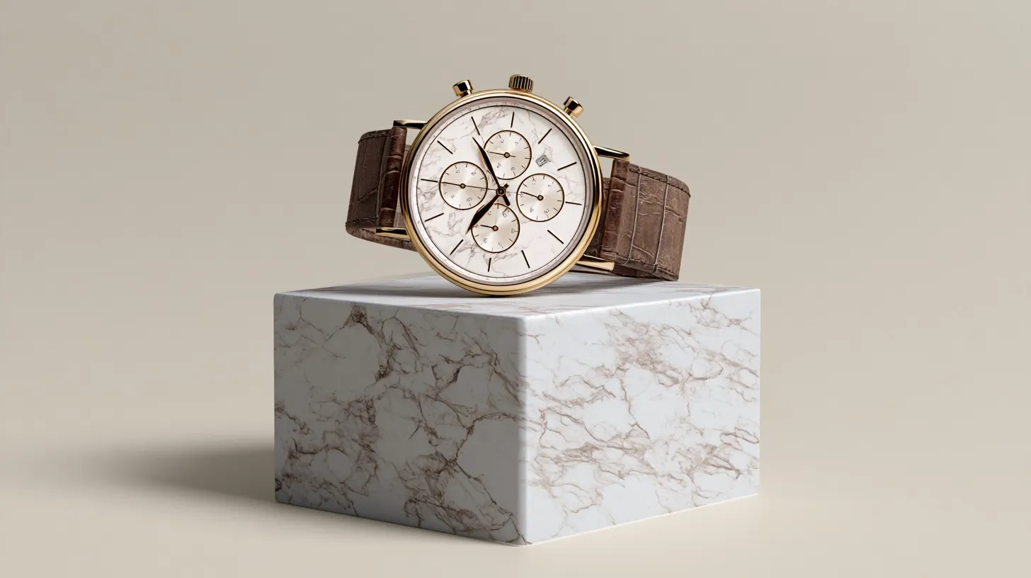 |
The reality: If you need precise product photos for e-commerce or commercial use, Midjourney is not the right tool. For mood boards, concept exploration, or lifestyle shots where the product is secondary, it works fine. But for precision commercial work where product detail matters. This is where Midjourney's weaknesses show up most clearly.
Score: 6/10 — Acceptable for exploration, not for final commercial output.
Test 6: The Text Rendering Problem — A Dealbreaker for Some
Midjourney's text rendering is its most consistent weakness. I tested this by running specific prompts asking for legible text. Here is what actually happened.
Prompt | Image Output |
| A modern café storefront. Large window with clean sans-serif text reading "CAFÉ MODERN". | 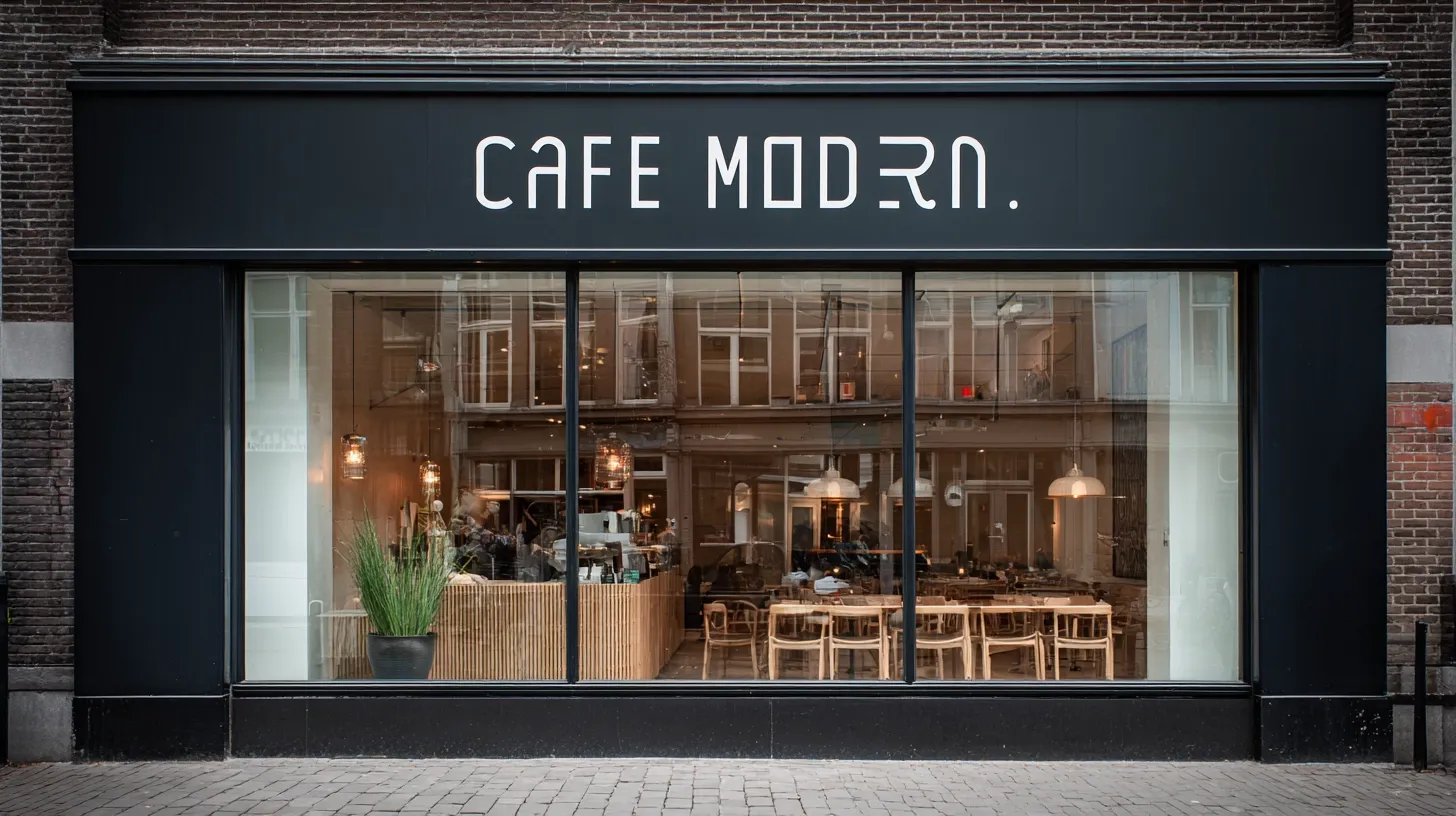 |
Result: Text appeared as "CAFÉ" with warped letters and "MODERN" as unreadable squiggles. Across five attempts, zero produced legible text.
Prompt | Image Output |
| luxury skincare bottle with a product label reading "PURE RADIANCE SERUM" in elegant sans-serif. | 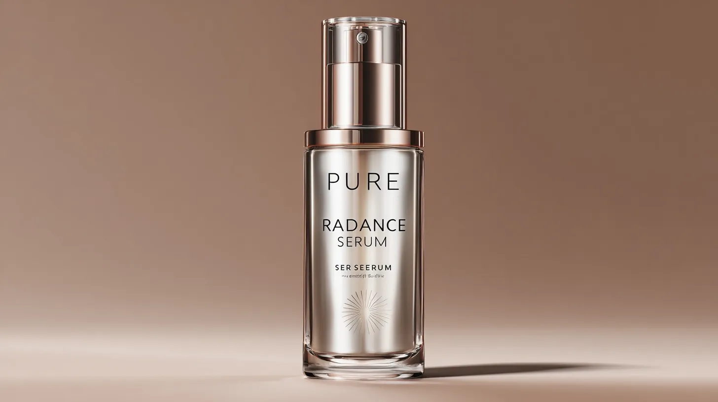 |
Result: Label text was warped beyond recognition. "PURE" might be partially readable, but "RADIANCE" became "RADANCE" with distorted letters, and "SERUM" was unreadable.
If your design requires legible text, use Nano Banana 2 or GPT Image 2.0 instead. Midjourney is a workflow blocker for text-dependent work.
Text Rendering Score: 2/10 — Effectively unusable for text-heavy designs.
AI Video Generation Testing about Midjourney
Midjourney launched video generation recently. This is new enough that I needed to test it thoroughly to give honest feedback. The feature takes any generated image and turns it into an image-to-video clip using motion prompts. I tested three different content types to understand both capabilities and hard limits.
Important context: Video generation is still early. Expectations should be calibrated accordingly — it is useful for specific scenarios, but not ready to replace dedicated video production tools.
Video Test 1: Atmospheric Landscape — Where It Excels
Image | Video Output |
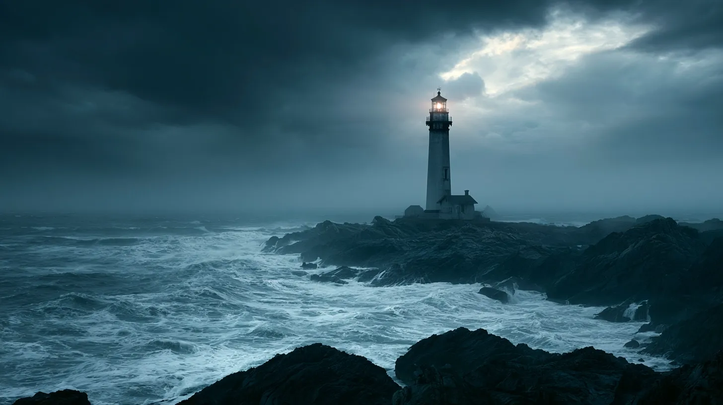 |
What worked: The atmospheric motion was handled excellently. Wave physics looked convincing — not flopping around unrealistically or using repetitive looping. Cloud movement felt natural rather than looped or stuttered. The camera pull-back revealed the scene progressively maintaining visual interest. Lighting consistency remained throughout the animation. The overall mood and tone did not break during animation.
Technical performance: Smooth frame interpolation without visible jank. No stuttering. Transitions felt organic.
Keeper quality: This is genuinely useful for social media content, mood boards, and concept exploration. A designer could use this for client presentations. A marketer could use this for social ads. Zero post-production needed — can drop directly into workflows.
Score: 8.5/10 — This is what video generation should be.
Video Test 2: Fantasy Scene with Multiple Elements — Moderate Difficulty
Image | Video Output |
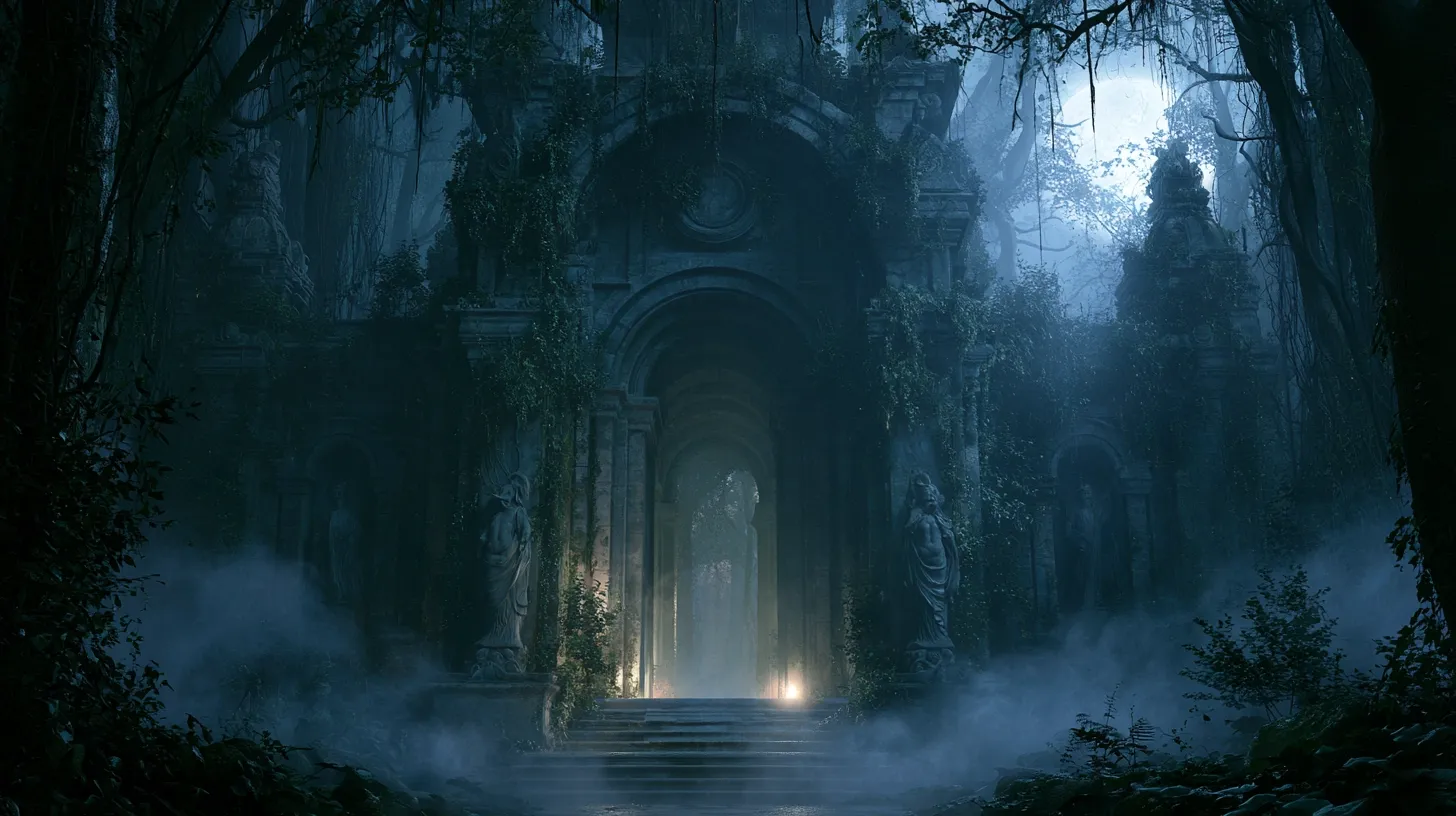 |
What worked: Layered motion was handled better than expected. Fog movement was subtle and believable — not overdone or stiff looking. The temple structure stayed stable while background elements moved naturally. Moonlight shift created dynamic lighting without feeling artificial. The camera pan was smooth without abrupt direction changes.
Complications: In one section, the vines seemed to shimmer slightly — not quite distortion, but not perfectly stable either. The fog had moments of popping or sudden density shifts between frames. Most viewers would not notice without looking closely, but it is there upon inspection.
Keeper quality: Better than expected for complex scenes. This could work in a video game trailer or concept animation.
Score: 8/10 — Handles layered motion surprisingly well.
Video Test 3: Portrait with Motion — The Problem Child
Image | Video Output |
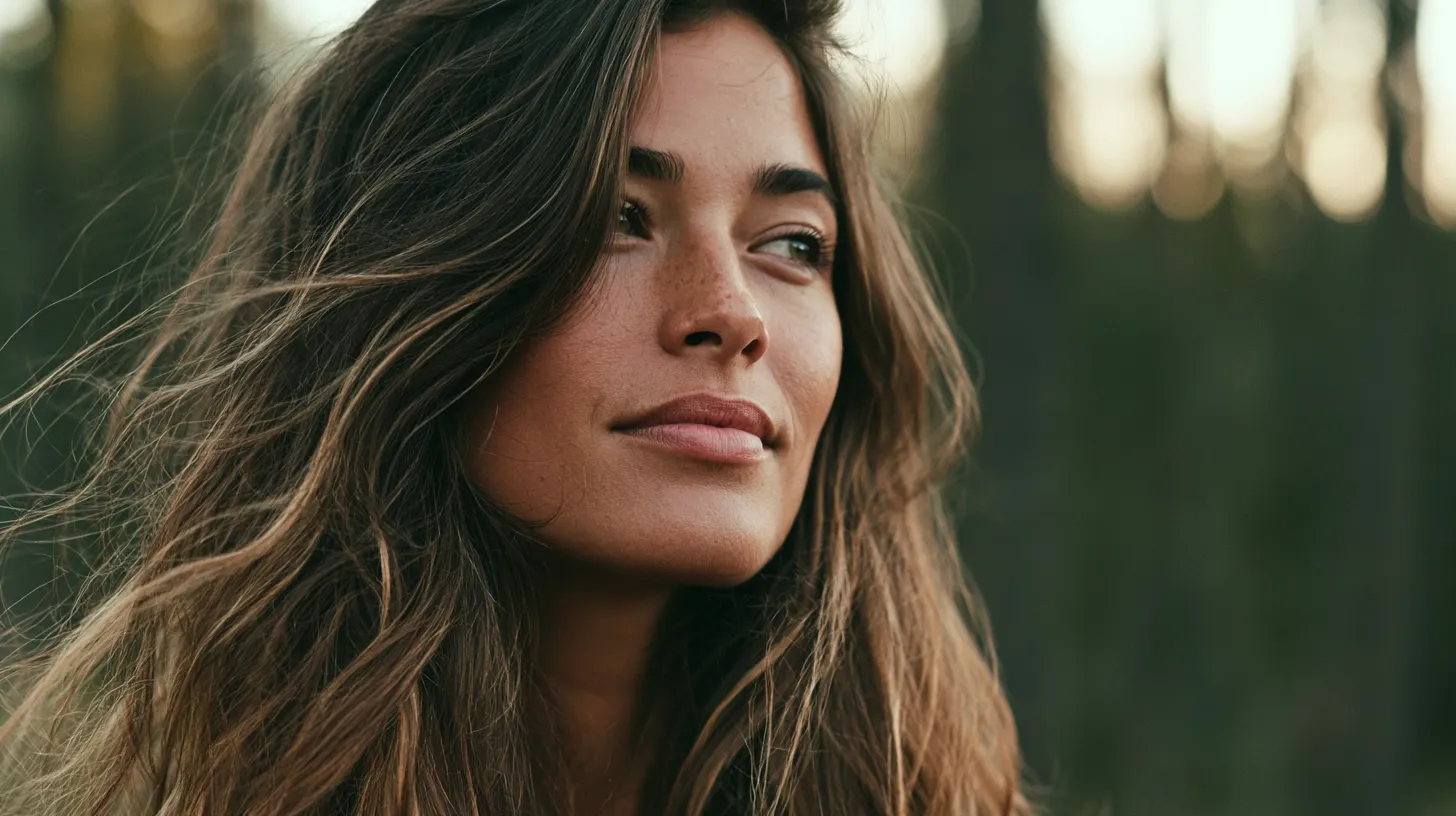 |
What went wrong: This is where video generation showed real limitations. Hair moved but had subtle warping — like it was made of rubber rather than hair. Eyes distorted slightly during the head turn — that uncanny valley feeling you get when digital humans are almost but not quite right. Facial features looked slightly plasticky during movement. The expression shift was jerky rather than smooth transitions.
The verdict: For human subjects, video generation needs more development. This is not ready for anything requiring natural human movement. That said, it is better than expected for this stage.
Score: 5/10 — Acceptable for abstract/subtle movement, fails on natural human motion.
What Real Users Actually Say
Community feedback is mixed, not uniformly positive. In one comparison discussion, some users preferred Midjourney’s stronger visual interest and prompt interpretation, while others felt that earlier results were more reliable. Another prompt discussion praised its understanding of descriptive prompts, but several users still reported weaker adherence when requesting specific compositions.
The clearest criticism is control. Users in a complex-prompt discussion reported problems with multiple subjects and exact instructions. Reactions to Midjourney video were more positive about visual consistency, although users also mentioned motion artifacts and fast GPU consumption.
That broadly matches my own tests. Midjourney remains strong when visual style matters most, but exact placement, readable text, and production-level control still require patience.
How to Access Midjourney Right Now
You can access Midjourney through its official website or Pollo AI.If you want Midjourney inside a broader creative workspace, Pollo AI offers a more flexible way to access the model alongside other leading image generators.
Midjourney is already available through the AI image generator on Pollo AI. You can enter your prompt, adjust the image settings, and generate without moving between separate platforms.
The bigger advantage is model flexibility. If Midjourney makes the image visually appealing but misses an instruction, you can test the same idea with Nano Banana 2 or Seedream 5.0. This makes comparison much easier. You can judge each model using the same prompt instead of relying on unrelated demo images.
Beyond model access, Pollo Agent can turn a rough idea, image, script, or URL into more complete content. I would use this route when I have a creative direction but do not want to build every prompt and production step manually.
Pollo AI also provides free credits for testing its creation tools. This gives you a practical way to explore Midjourney and compare it with other models before committing to a larger workflow.
Midjourney AI Strengths & Weaknesses Summary
Genuine Strengths:
Strong cinematic and atmospheric image quality in my tests
Excellent results for fantasy, concept art, and mood exploration
Fast visual iteration
Flexible style and reference controls
Useful image-to-video animation
Active creative community
Real Weaknesses:
Text may still require manual correction
Exact product reproduction needs careful testing
No generally available public API
Human motion can produce visible distortions
Precise object placement remains difficult
Complex scenes may contain structural errors
The Bottom Line
Midjourney excels at artistic, cinematic, and atmospheric imagery, but it is less reliable for exact text, spatial placement, and repeatable commercial work. Its video tool also works well for subtle animation, although complex motion still needs close inspection.
The real question is whether Midjourney fits your task. It is worth exploring for concept art, moodboards, social visuals, and creative imagery. For text-heavy layouts, precise product visuals, or strict production work, expect extra editing or choose another tool.